

Dirt Diggers is a garden maintenance and garden supplies company based in St Albans. The brief was to create a brand that felt approachable, practical and memorable, while clearly rooted in the world of gardening.
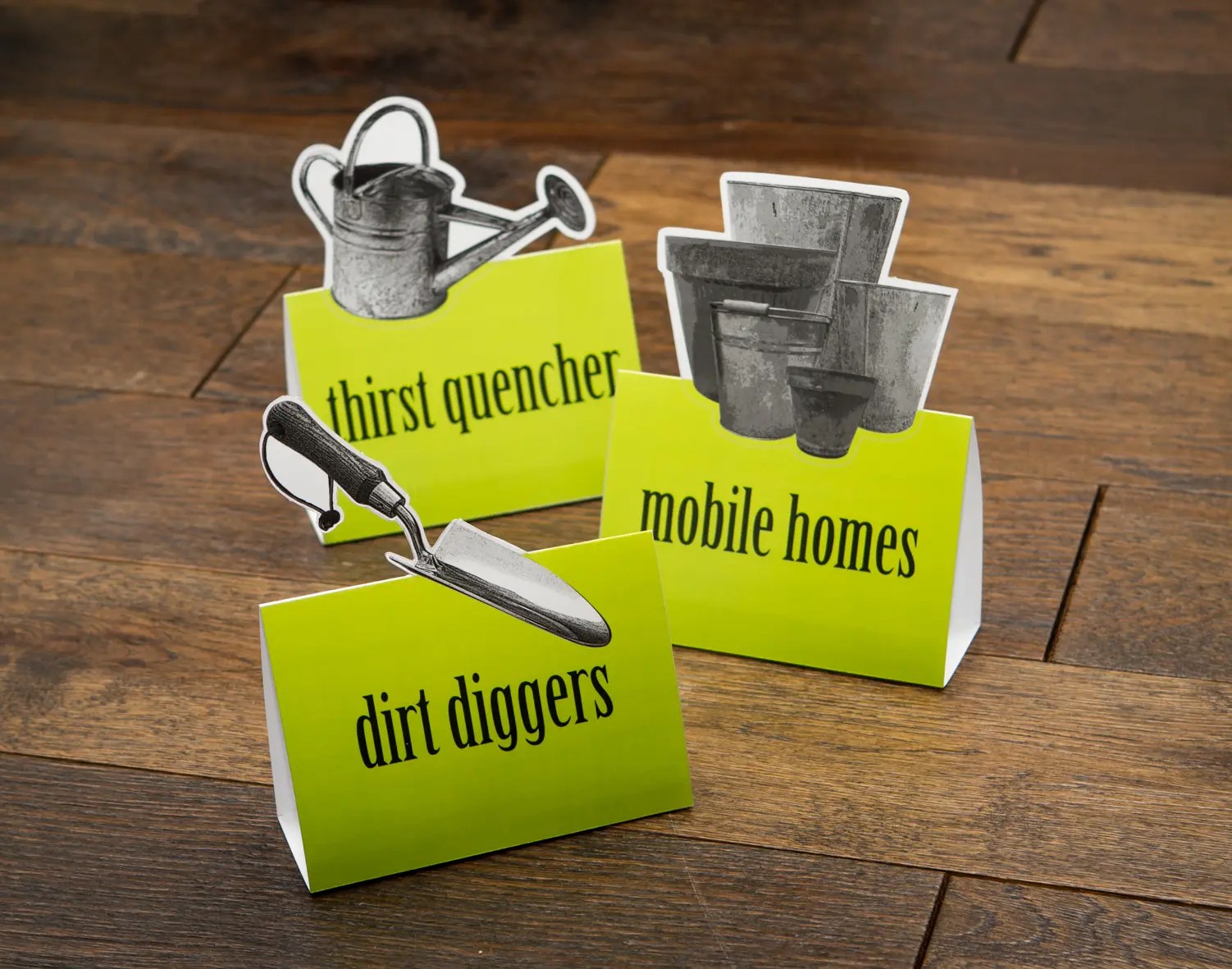
The logo is designed in the shape of a traditional plant label. This instantly recognisable form creates a strong visual link to gardening and growing, making the brand easy to understand at a glance. The label shape also works well as a standalone brand icon across signage, packaging and digital applications. A subtle angled placement adds character and energy, helping the logo feel distinctive and slightly quirky rather than static or corporate.
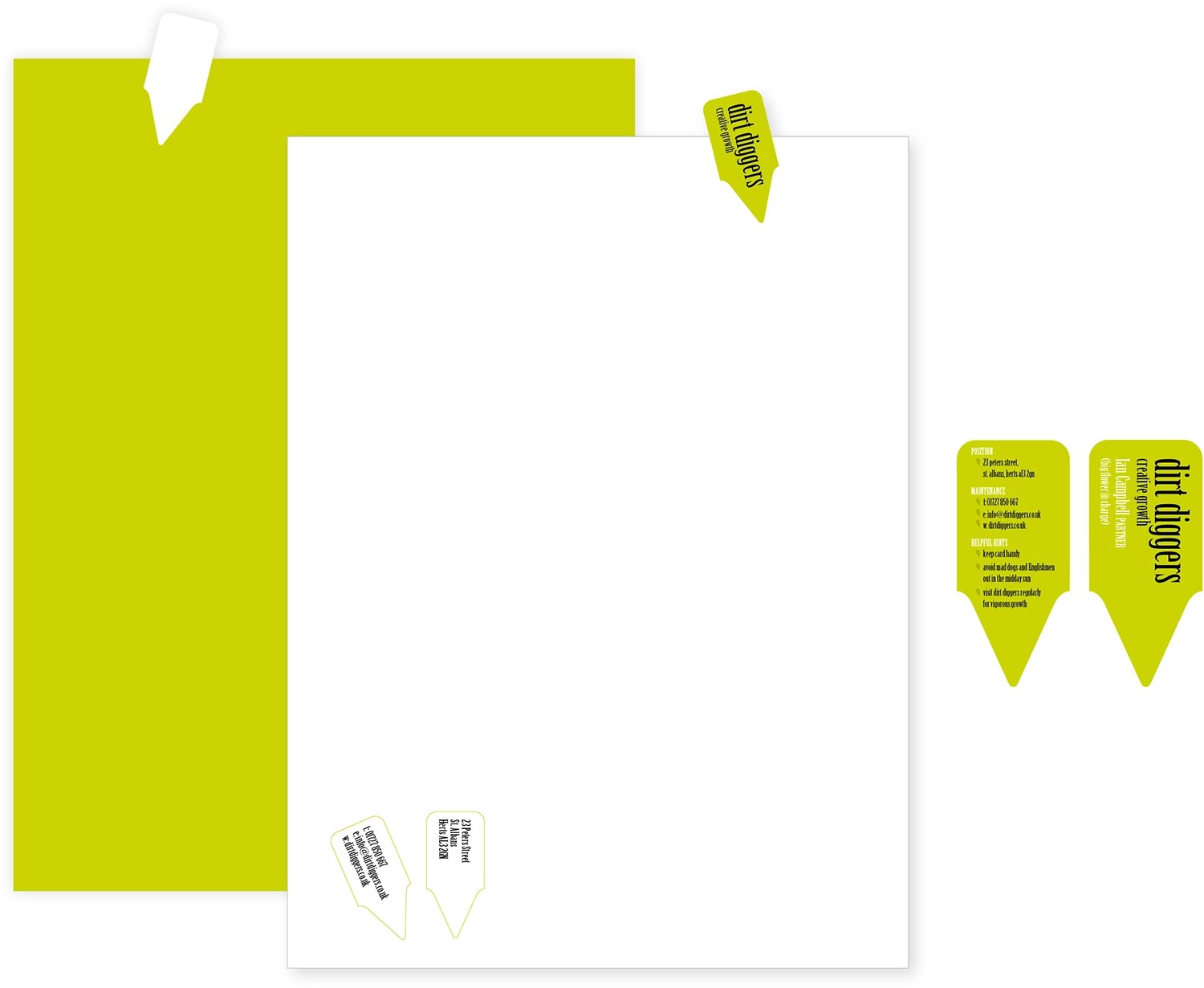
The brand colour is a bold, modern green that reflects nature, growth and the outdoors, while also feeling fresh and contemporary. This vibrant tone, which I’ve named “fresh shoot green”, gives Dirt Diggers a confident presence and helps the brand stand out from more traditional garden businesses that rely on muted or earthy palettes.
Typography plays a key role in reinforcing the brand personality. The chosen typeface, Birch, is a condensed display font with strong verticals and distinctive rounded descenders. These rounded forms subtly echo plant roots pushing down into the soil, creating a visual connection between the lettering and the natural world. Its handcrafted feel adds warmth and approachability, while the condensed proportions keep the logo compact and highly legible across different formats.
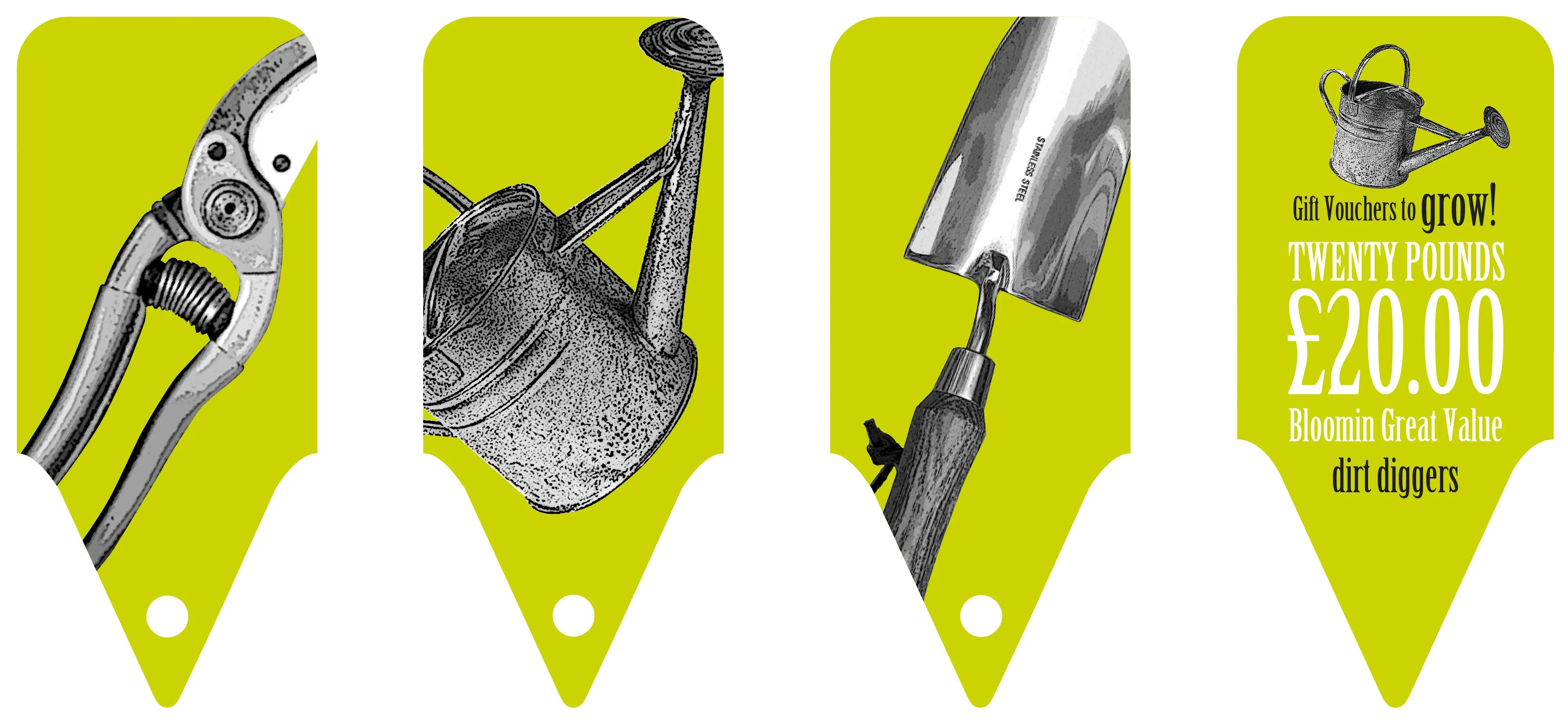
The brand was rolled out across a full range of applications, including stationery, business cards, online advertising, web banners, shelf displays and motion graphics. Each piece was designed to maintain consistency while allowing the logo and colour palette to work flexibly across print, digital and environmental uses.
The result is a bold, recognisable identity that feels grounded in gardening, yet modern, friendly and built to grow with the business.
