

Motion has always been part of how I think about design. The best animation isn’t just a graphic that moves – it’s an idea given time to breathe, a message that lands differently because it unfolds. After years of creating animated content for global advertising campaigns, social feeds and brand communications, motion became as natural a part of my toolkit as print or digital.
The work here spans different purposes and scales – from personal typographic experiments to travel storytelling and commercial promotional content. Each piece starts with the same question: what does this idea need to do, and how does movement help it do that better?
Chasing winter light on the streets of London
A short video of still images I took on a stunning early January winter’s day in London. Wandering around the streets following the light capturing life as it happened in high contrast black and white images.
Cinematic promo teaser for a creative project
This promotional teaser was created to build anticipation and atmosphere for Twelve Remain – a project with a strong visual identity and a story that needed to be felt before it was fully explained. The brief was essentially: create tension. Using carefully selected footage, a considered colour grade and sound design that rewards attention, the teaser establishes mood and intrigue without giving too much away. It’s the kind of work that sits at the crossroads of motion design and film craft, and a format I enjoy working in when a project calls for it.
Typography in motion – responding to a cultural moment
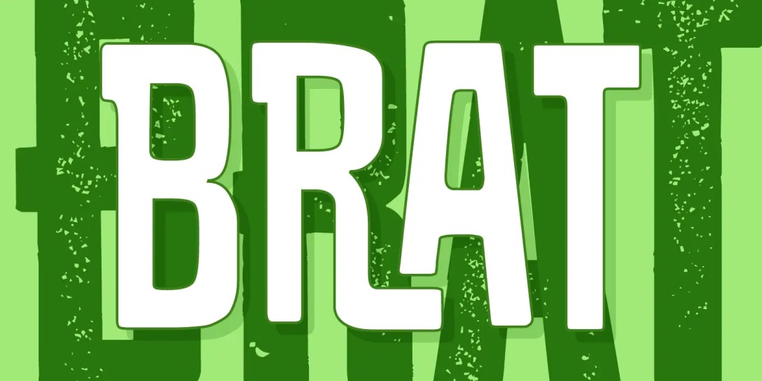
When Collins Dictionary named brat as their word of the year, it felt like exactly the kind of typographic challenge worth jumping on. This animation is a response to that moment – an exploration of how a single word can carry attitude, energy and cultural weight through type, colour and movement alone. Bold, direct and intentionally unapologetic, the animation leans into the aesthetic that made the word famous in the first place. It’s a personal piece, but also a useful demonstration of how quickly a strong typographic concept can be developed into something visually alive.
The world is your oyster!
Santorini, Bali, Malta, Menorca, Lanzarote, Vietnam. Just some of the fantastic destination maps illustrated in this short video.
Long shadows over London streets
A study in contrast and form, capturing striking black and white images that reveal the interplay between London’s historic and modern architecture. This short video showcases a selection of stills from the shoot, highlighting the detail, texture and geometry found across the city.
Long shadows over London streets part deux
A return to the streets of London, chasing the light. High-contrast black-and-white photos from my solo photo walk around the city. Despite the chill, it was a fantastic day! The low winter sun created beautiful long shadows and striking contrasts between the buildings, making it a perfect day for photography.
Masterminds, meaningful debate and memorable food
The Small Business Hub Curry Club mastermind lunch in St Albans brought together local business owners for an afternoon of sharp thinking and open conversation. Hosted by Sanjeev Bhavnani and held at Infuse, a modern Indian restaurant owned by Sameer Berry, the setting matched the energy in the room.
Discussion moved quickly across current business challenges and opportunities, with genuine insight shared around the table. Strong personalities, differing perspectives and a relaxed atmosphere made for a session that was both engaging and memorable.
Photographed in a documentary style, the focus was on real interaction rather than staged moments. This short video, created from a sequence of still images, captures the pace, energy and authenticity of the event.
Five things that got me gingered up this…
Every month I curate five creative things that have genuinely caught my attention, from kinetic sculpture and music videos to installation art, brand identity and handmade craft. No theme, no algorithm, just five things that made me stop scrolling and actually look. I call it Five Things that got me Gingered Up, which is a nod to my Scottish roots: gingered up means properly excited about something.
This is the June 2026 edition. The animated title sequence was built to stop the scroll, bold type, rhythm and a bit of Scottish character packed into a few seconds of social-first motion. Simple idea, but it has to work instantly or not at all.
Turning a static testimonial into something people actually stop for
This testimonial started life as a plain JPG, the kind you scroll past on LinkedIn without a second glance. Good words, forgettable delivery. So I took it into After Effects and gave it some life: the text builds in, the quote marks land with a bit of weight, the client’s name and title reveal at just the right moment. Nothing flashy, just enough movement to make someone’s eye stop scrolling.
The difference in engagement was obvious almost straight away. A static quote asks people to read; a moving one asks people to watch, and watching holds attention longer than reading does. For a design business, that matters. It’s proof that even the smallest pieces of content, the ones most people would knock out in five minutes on Canva, are worth treating properly. If a testimonial can carry a bit of craft, everything else in the feed should too.

