
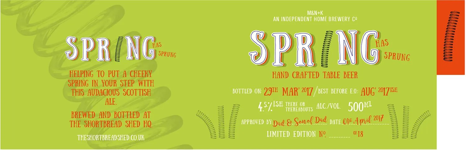
Spring has Sprung was a playful branding and label design created for a small home brew made at the turn of the season. From the outset, my brief was about character, humour and memorability rather than polished perfection. I wanted the label to feel handcrafted, confident and full of personality, much like the beer itself.
A playful take on spring
Springtime naturally brings familiar visual cues like flowers, leaves and soft pastels. Instead of leaning into the expected, I chose to take a more quirky and literal approach. The name itself opened the door to a visual pun, so I replaced the letter I in Spring with an actual metal spring. This became the centrepiece of the logo and immediately gave it a sense of movement and wit.
The hand-drawn lettering reinforces this personality. Slightly imperfect and full of character, it gives the logo a friendly, homemade feel while still being bold enough to stand out on the shelf.
Colour with purpose
The colour palette was built around vivid green and bright red to reflect the freshness and energy of spring. The green feels lively and seasonal, while the red adds contrast and confidence. Together they create a strong visual punch that feels celebratory rather than subtle.
One of the key features of the label is the small red tab that sits proud at the side. This was a deliberate design choice to create a standout detail that catches the eye and sticks in the memory. It adds a physical sense of depth and gives the bottle a distinctive silhouette when viewed alongside others.
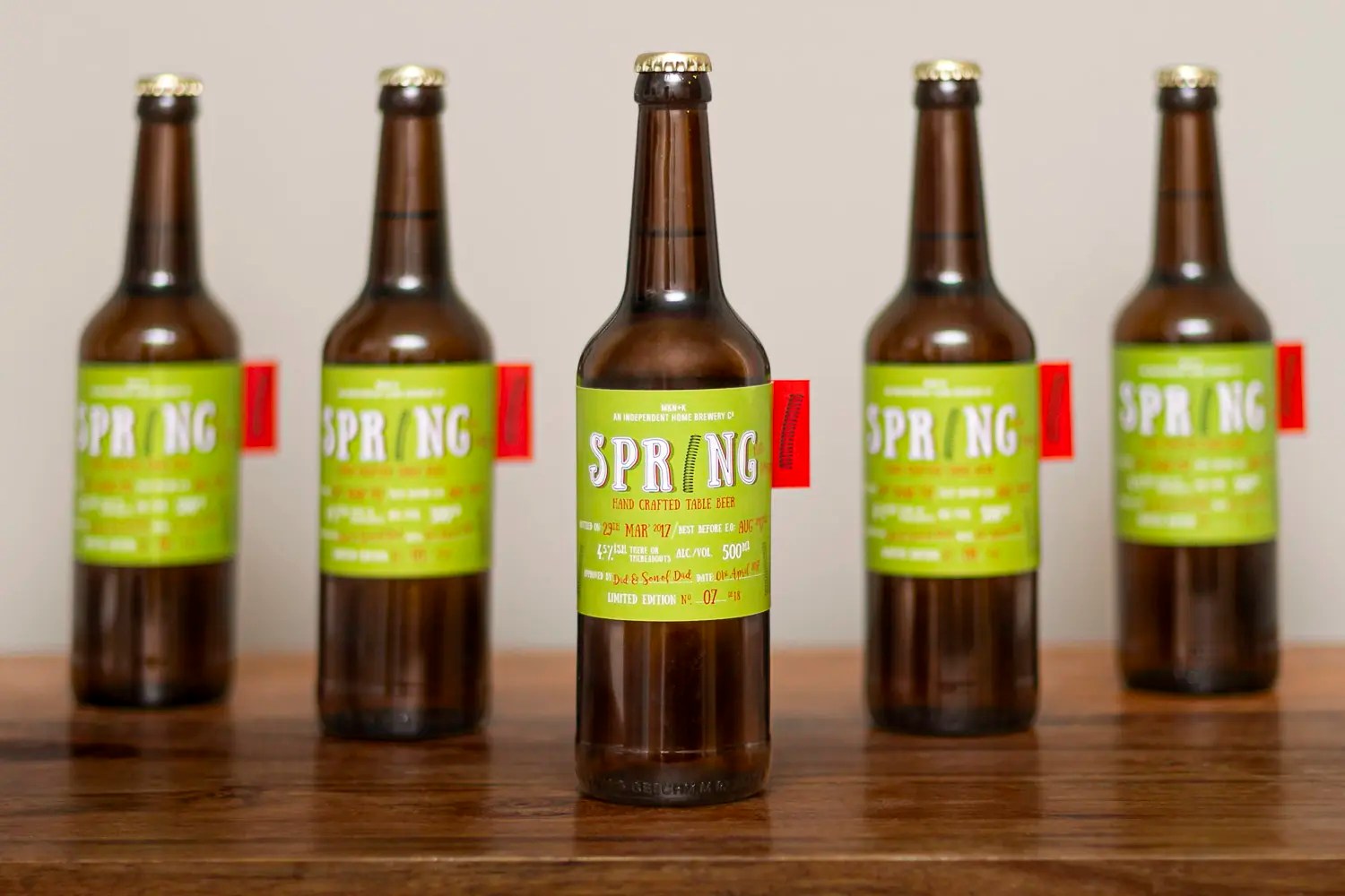
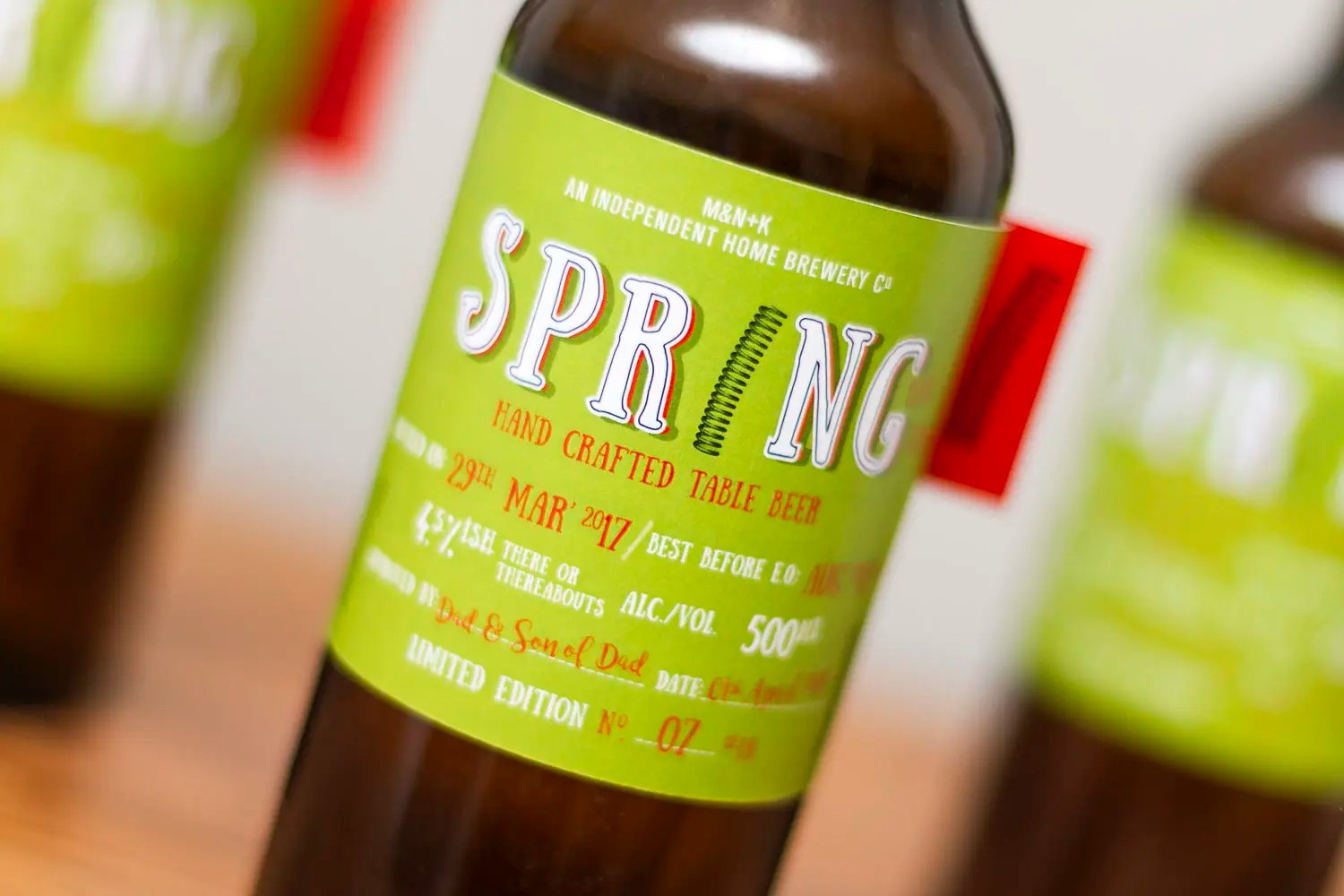
From flat label to physical bottle
Seeing the label applied to the bottles brought the design to life. The combination of the bold colours, quirky logo and side tab works particularly well in a row of bottles, where the repetition reinforces the identity and makes the beer instantly recognisable.
This project was a great example of how small, thoughtful details can elevate a simple product. By leaning into humour, bold colour and an unexpected visual idea, Spring has Sprung became a label that feels fun, confident and memorable, just like the season that inspired it.
