
Tiny typographical marks with big characters.
This project began as a simple curiosity. What happens when familiar symbols are given time, space, and motion to breathe?
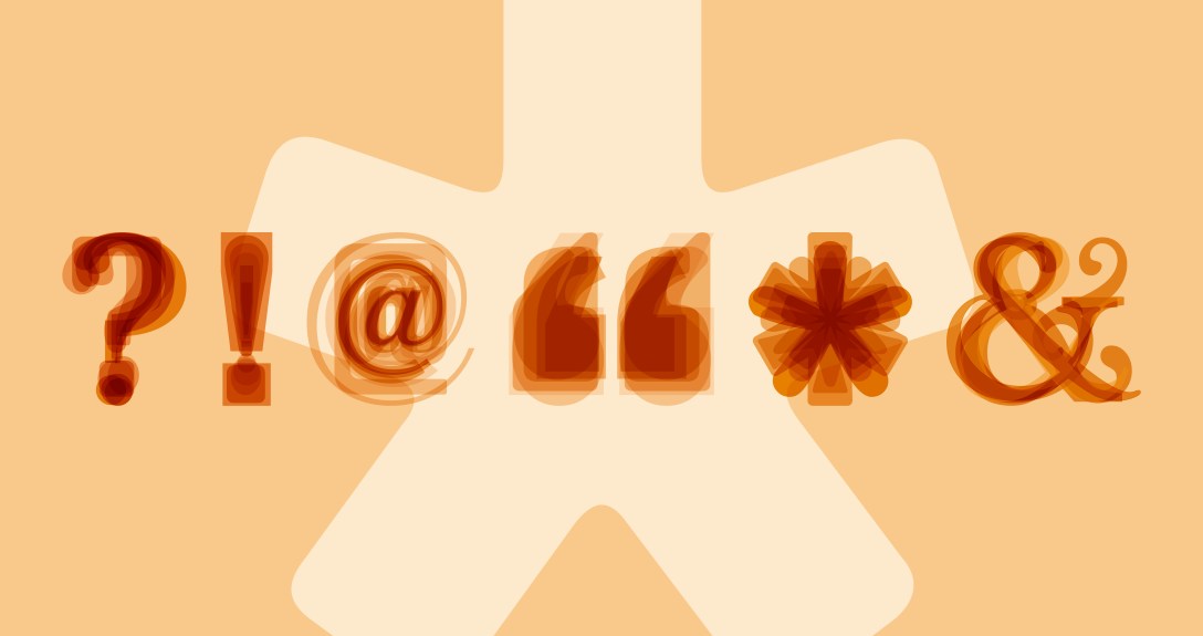
I explored a small, considered mix of typefaces, weights, and sizes that sit comfortably together. Each font brings its own character, paired with a contrasting colour to create quiet tension and balance. The symbols are layered and stacked, playing with transparency, rotation, zoom, and gentle fades, forming a calm, almost kaleidoscopic rhythm.
A layer of mellow music ties everything together. Soft, slightly hypnotic, and designed to slow things down, it turns these everyday marks into something more immersive, soothing both the eyes and the ears.
A reminder that even the smallest details in typography can carry unexpected expression when you let them move.
