

Every year, one parcel comes through our letterbox that I’m more excited about than any other. It’s flat, it’s brown, and inside it is our whole holiday.
I’ve designed a photo book for every family holiday for 17 years. Last year’s was Thailand, and it’s called Seven Eleven Heaven in Hua Hin. Here’s how it came together, from typeface to final print.
The one job where I’m the client
Most of my design work starts with someone else’s brief. This one starts with a diary.
Every day on holiday I write down what we did and where we went. By the time we’re home, that diary is the brief: the story, the order, the bits worth keeping. Without it, two weeks blur into one.
Then I go back through literally thousands of photos in Lightroom and cull them down hard. Fewer, stronger pictures always make a better book.
Thousands of photos, culled down to the ones that tell the story.
Picking a typeface for Thailand
Every book gets its own typeface, chosen for the country. For Thailand I went with Osaka-Sans Serif, because it embodied all the street, shop, bus, and any other sign that had any typography lettering on it, this seemed to fit the energy of the vibe of the place.
The title is set big and red on the cover, so it reads clearly from across the room. That matters more than you’d think. On a shelf of 17 books, the title and year are how you find the one you want.
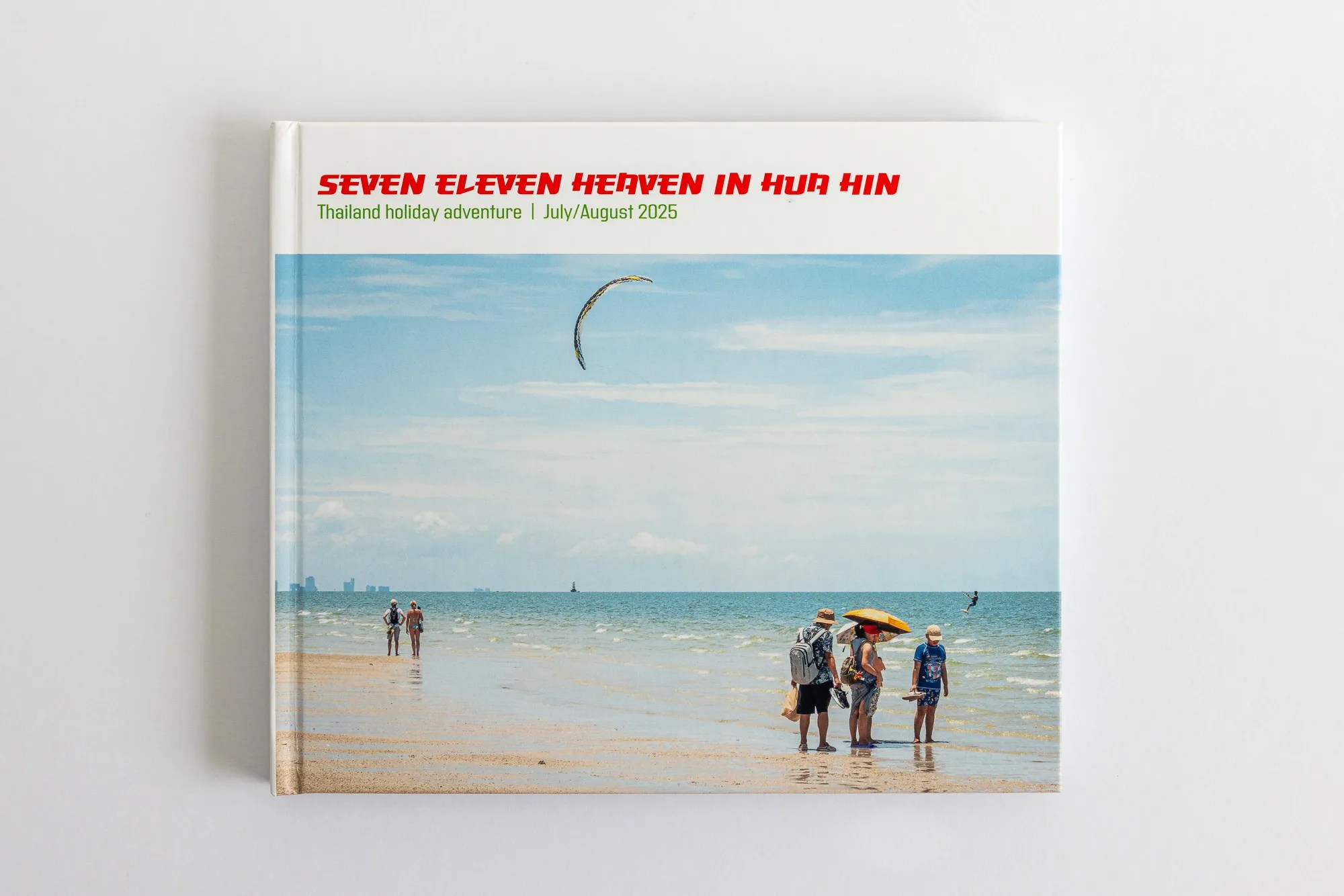
The cover. Big, red and easy to spot on the shelf.
Colours borrowed from the place
I always take the colours from the country itself. This time the source was on every street corner: the red, green and orange of the 7-Eleven sign. Red for the title, green for the diary pages, and both together on the map.
7-Eleven turns up in the photos too, which is partly where the title came from. After a hot day by the pool or walking around the area we would often take a short stroll up to the local 7-Eleven. Not only was it a welcoming cool santuary, where we could take five and enjoy slowly browsing along the freezer isle away from the intense heat they also served some rather nice snacks.
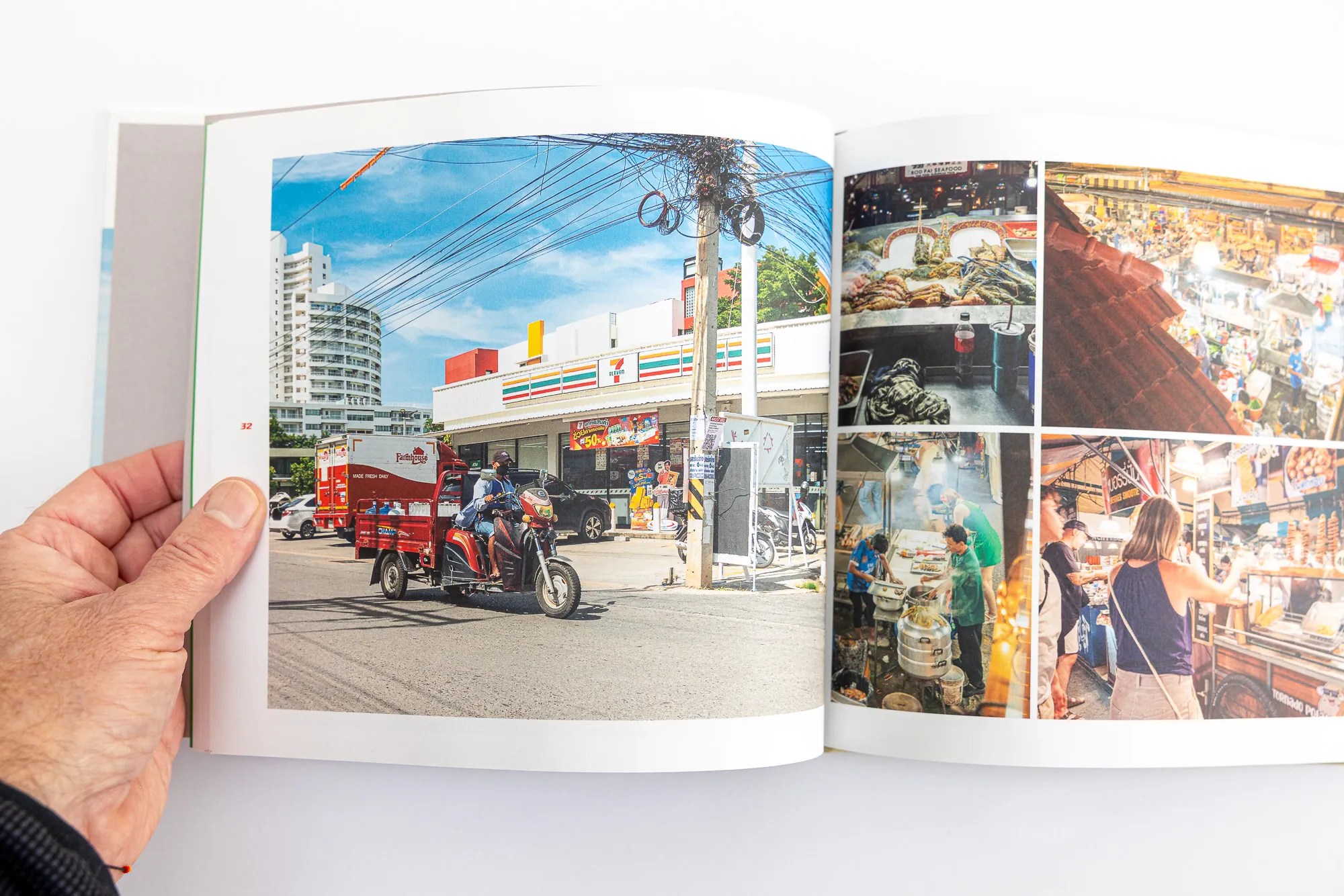
A 7-Eleven on every corner, and a night market on the next page.
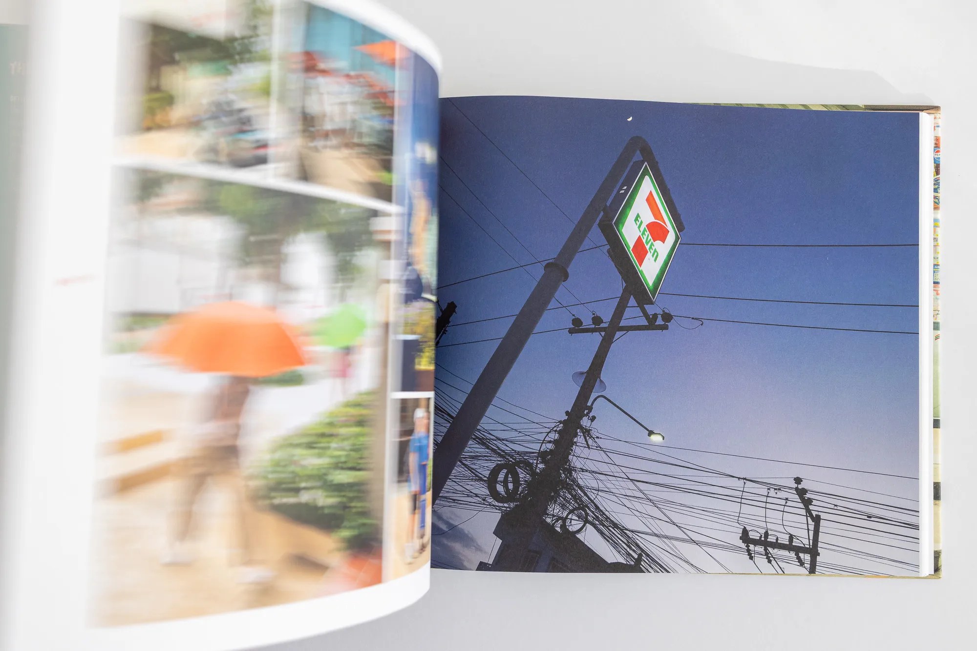
The sign that gave the book its colours.
Every book gets a map
The map is my favourite page to design. For this one, Thailand sits in bright green over one of my photos of the country’s famous tangles of overhead power cables, tinted deep red. Bangkok and Hua Hin are marked, and that’s it.
Opposite the map, the holiday diary is printed on green pages, so the day-by-day story sits right beside the pictures. I build the maps in Illustrator or InDesign and keep them simple on purpose: one shape, a couple of places, no clutter.
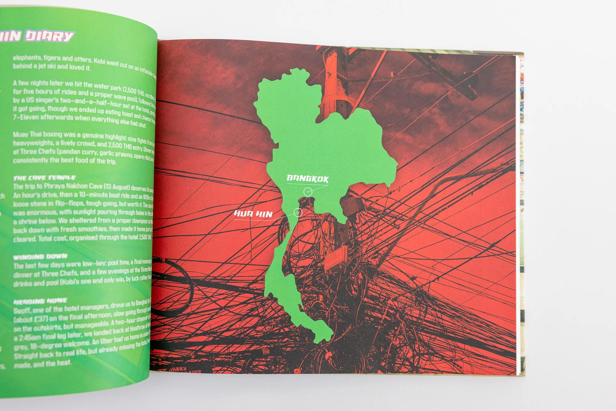
Thailand in green, over the power cables you see on every street.
Pacing the pages
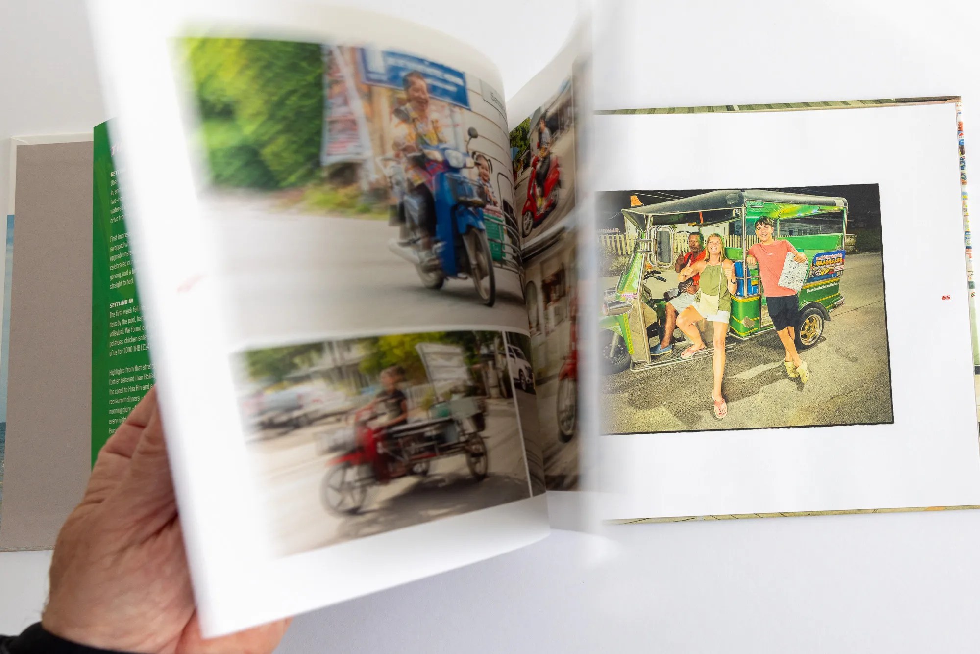
A good photo book has rhythm. Busy days get busy pages: a night at the Muay Thai boxing becomes a full-bleed run of fight photos, and a day at the water park becomes a tight grid.
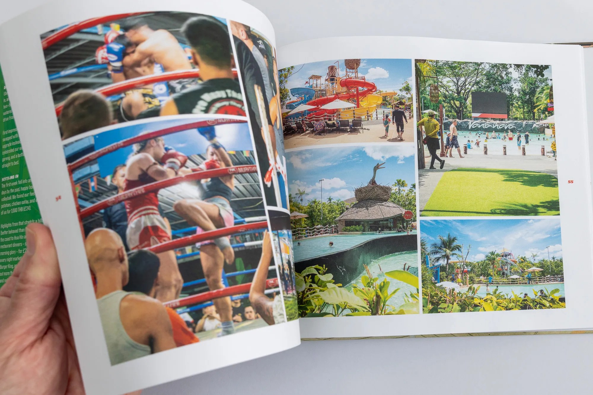
Busy days get busy pages.
Then the pace drops. Quieter moments get a page to themselves, and some pictures get a film-style border, which slows you down and makes you really look. The fishing harbour and the two fishermen who gave us a big thumbs up are among my favourites.
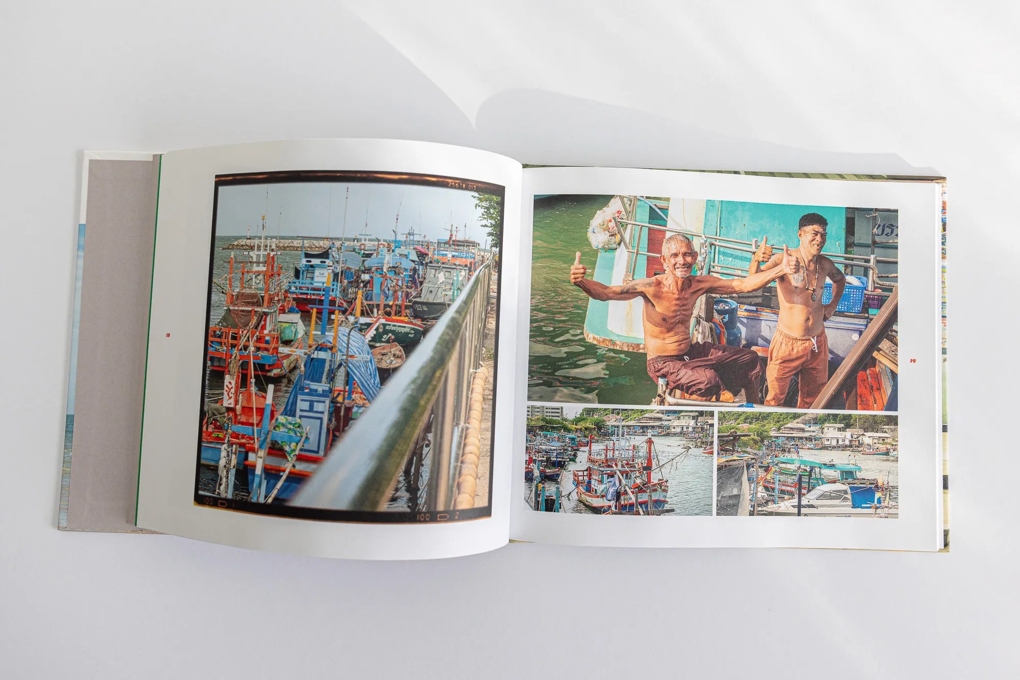
Hua Hin harbour, and the friendliest fishermen in Thailand.
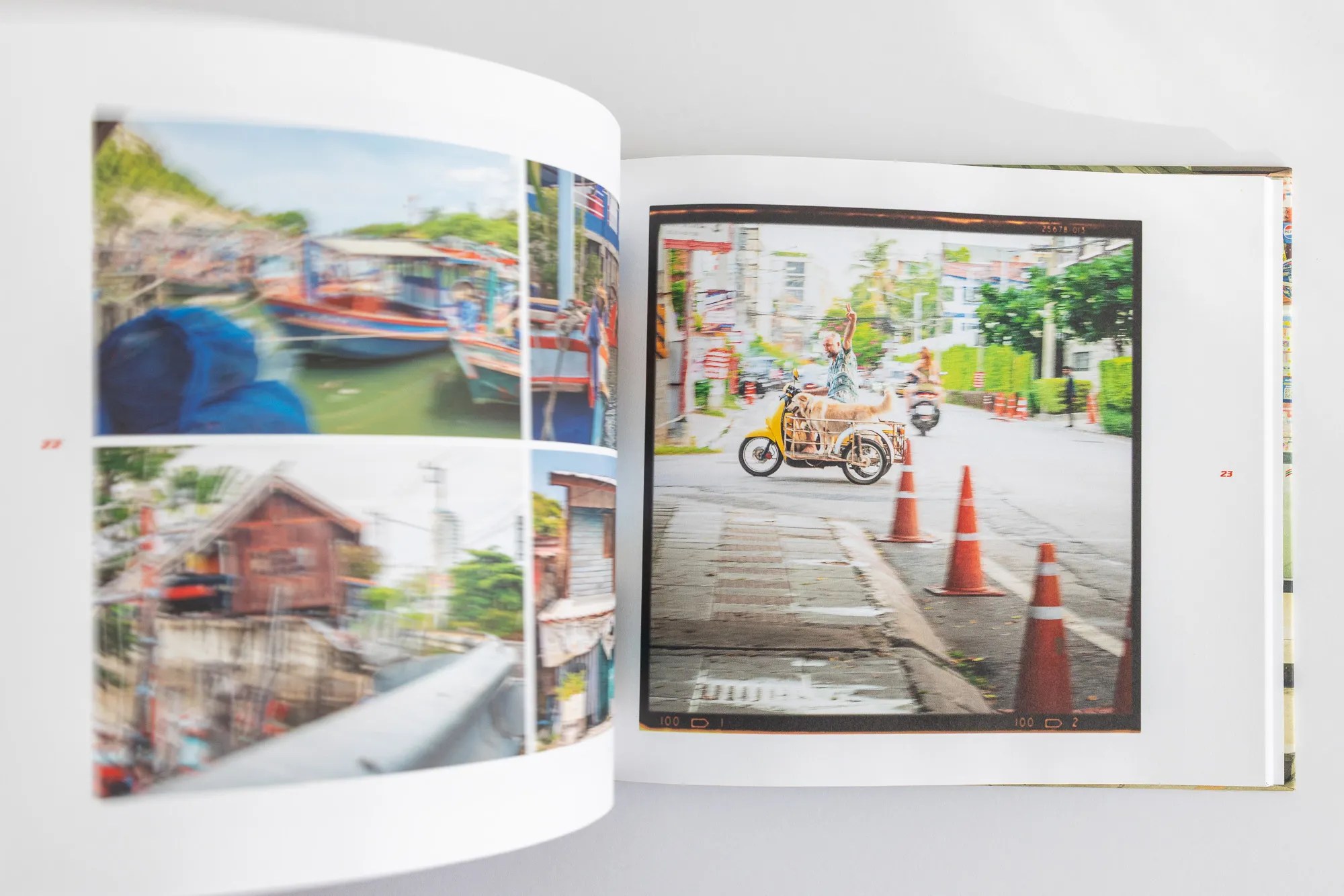
A film-style border makes you stop and look.
Printing it properly
I print with Blurb, in full colour on uncoated paper, with a photo wrapped all the way around the hardback cover. Uncoated paper has no shine, so there’s no glare, and it feels lovely to turn. Photos look natural rather than glossy.
The back cover had to be a 7-Eleven at night, glowing under the strip lights, with the doors open and people wandering in.
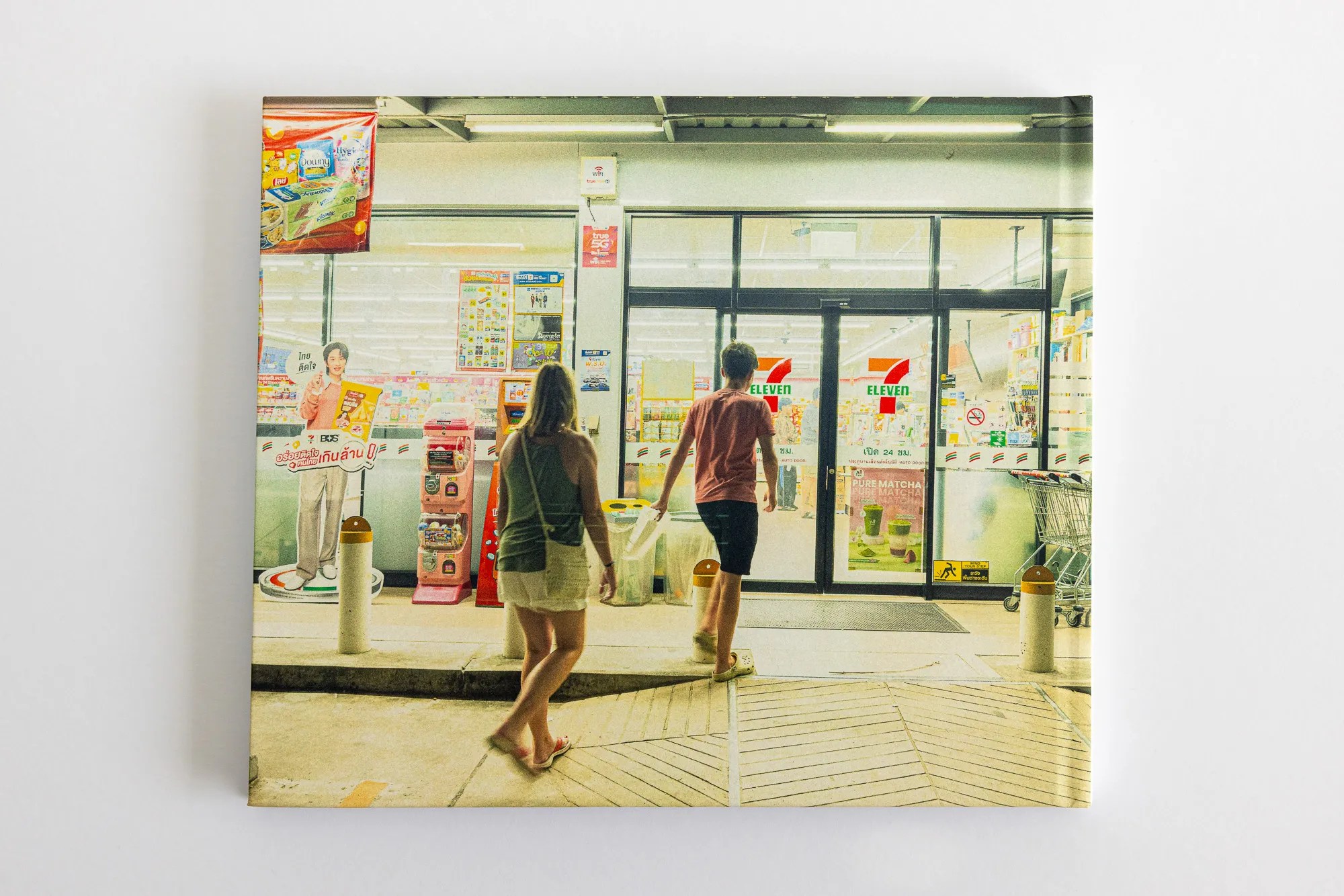
The back cover, and where the title came from.
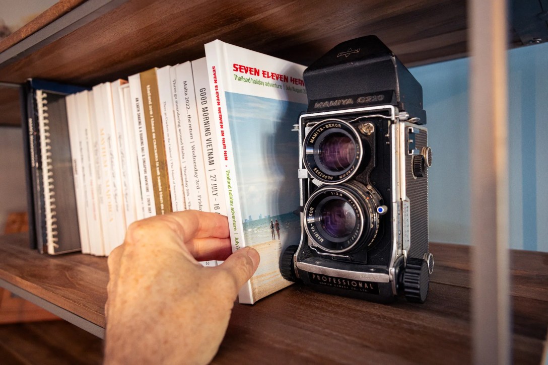
Back on the shelf
Once it’s arrived, it goes straight onto the shelf with the others. That’s the bit that makes it all worth it. Any time we fancy, we can pull one down and be straight back there.
Photos on a phone get forgotten. Photos in a book get picked up, passed around and looked at again and again.
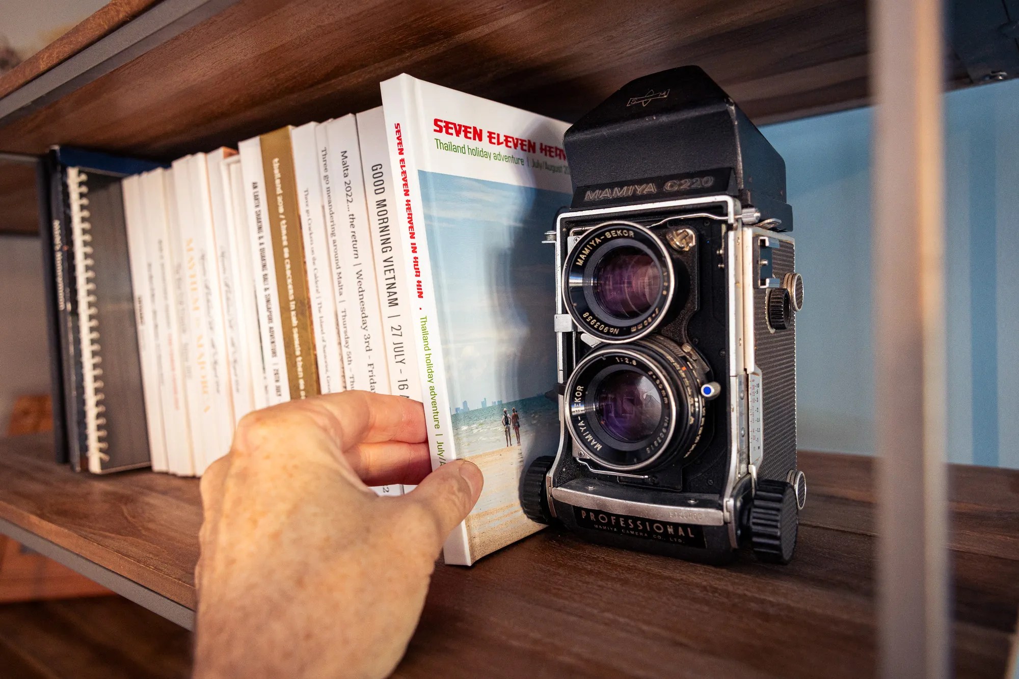
Back with the others.
Fancy one of your own?
If you’ve got a holiday, a wedding or a whole year of photos sitting on your phone, I’d love to help turn them into a book. I can edit the pictures, choose the type and colours, draw the map, and get it printed as a hardback that’s worth keeping. Drop me a line if that sounds like your kind of thing.
Questions people ask
How do you design a holiday photo book?
Start with a diary from the trip, cut your photos down to the best, then choose one typeface and a few colours that suit the place. Mix busy grids with single big pictures so the pages have rhythm.
What’s the best paper for a photo book?
I use uncoated paper. It has no glare, feels softer in the hand, and makes photos look natural.
Which company prints your photo books?
Blurb. The colour is reliable and the image wrap hardback cover looks great.
How do you choose colours for a travel photo book?
Look at the signs, shop fronts and packaging you saw every day on the trip. For Thailand, the 7-Eleven sign gave me red and green, and they run right through the book.
Can you design a photo book from my photos?
Yes. I can work from your own pictures and design the whole thing, from cover to map to final print.
Thanks for reading. I’m Mike, a graphic designer and brand consultant based in St Albans, Hertfordshire. I design logos, labels, packaging, photo books and everything in between.
If you’ve got a project brewing, I’d love to hear about it. Drop me a line, or have a nose around my portfolio.


